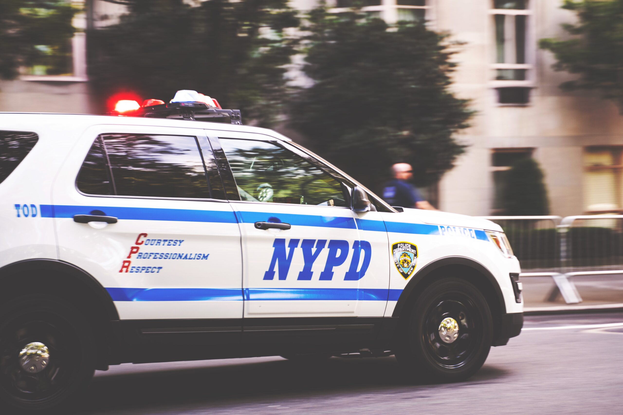
Let’s say you see a vehicle pull into a parking lot at dusk. It has visible decals under the streetlights, and its logo is apparent. You also see the unmistakable word “SECURITY” printed on it. Based on these symbols and decals, you won’t confuse it with a police car.
That clarity isn’t an accident. Quite the opposite, actually! The truth is, it’s actually thanks to design choices, legal requirements, and practical experience. The distinction between private security vehicles and police vehicles matters, visually, functionally, and legally.
Getting that difference right goes a long way toward building public trust, supporting compliance, and keeping everyone involved safe.
With that in mind, let’s talk about how to make sure security vehicle graphics aren’t conflated with those of police departments, as well as how to ensure your designs send the right message.
Why Vehicle Graphics Matter in Public Safety
Whether it’s a police cruiser, a sheriff’s SUV, or a private patrol car, marked vehicles influence how people behave.
In fact, this phenomenon has been studied, and there are interesting findings regarding the public’s perceptions and behaviors toward marked vehicles.
The presence of a clearly identified vehicle can:
- Prevent crime before it starts
- Signal authority
- Reassure visitors or residents
- Clarify who to approach (or avoid) in a stressful moment
It’s also worth emphasizing that decals aren’t just decorations. Instead, they also communicate purpose and shape first impressions.
Not to mention, they also have to be legible, durable, and appropriate to the role of the vehicle.
For security companies, that creates an interesting challenge.
Of course, you want your vehicles to look official. But at the same time, you don’t want to cross legal lines or cause confusion in an emergency.
The Legal Line Between Security and Law Enforcement Vehicles
Police and sheriff vehicles are subject to strict regulations, especially when it comes to markings, color patterns, and insignia. They often use standardized designs mandated by state or municipal codes.
Private security firms don’t operate under the same authority. But that doesn’t mean anything goes.
In most jurisdictions, it is illegal for a private security vehicle to:
- Use the word “POLICE”
- Imitate the design, color scheme, or badge of a public law enforcement agency
- Include emergency light bars or sirens designed for police use
- Misrepresent authority to the public
That means security vehicles need to carve out their own visual identity, distinct from law enforcement, but still highly visible and authoritative in their own right.
Major Visual Differences: What to Look For
There are a few distinct areas where the designs of police vehicles and private security vehicles diverge: wording, badge styles, decals, lighting, and uniformity.
Keep reading to see what we mean.
Wording
Wording is one of the most visible differences.
Police vehicles use terms like “POLICE,” the name of the department, and the jurisdiction they serve. These are often paired with official symbols and titles that reflect government authority.
In contrast, security vehicles should clearly use the word “SECURITY.”
They typically include the name of the private company and its contact information.
These vehicles may also display a company slogan or service description, but the wording should never imply government affiliation.
Badge style
Badge style also plays a starring role in public perception.
On marked law enforcement vehicles, you’ll often see a department-issued seal, crest, or shield that represents a city, county, or state. Most people can recognize these legally-protected symbols pretty quickly.
Security companies can create their own custom logos or insignias. These symbols look professional and send a message without imitating government emblems.
Decal materials
Decal materials used by police departments tend to be high-visibility and standardized. Reflective materials, especially white text on black vehicles or black text on white vehicles, are the most common choices.
These contrast-heavy designs increase nighttime visibility and align with emergency response needs.
Security vehicles also often use reflective materials, but they have more freedom to introduce color.
Non-reflective materials are sometimes used in private fleets when contracts or branding call for it. The trick is to remain visible while leaving room for brand identity.
Lighting
Exterior vehicle lighting is another critical distinction.
For example, police vehicles can use red and blue emergency lights in most jurisdictions, often with strobe functions. These lights are regulated and restricted for use by law enforcement only.
Security vehicles, on the other hand, are generally allowed to use amber or white lights. These colors are meant to provide visibility without crossing into restricted emergency use.
Using red or blue lighting on a private security vehicle can result in serious legal penalties, so this is an important point to remember.
Further, amber lighting does not give security vehicles right-of-way in any state; they are cautionary only.
Uniformity
You’ll also notice differences when it comes to uniformity between public and private fleets, too. Most police departments follow strict design protocols so all cruisers look consistent across the jurisdiction. That consistency is intentional: it reinforces their official presence.
Security companies usually operate differently and vary based on the type of property being serviced, client branding requirements, or regional preferences.
Consistency within a security fleet is still helpful, but customization is far more common in the private sector.
Security vehicle graphics should never mimic law enforcement patterns too closely. But they should remain professional, legible, and easy to identify, even from far away.
The most successful designs can strike a balance between clear authority and not overstepping into government territory.
Preventing Public Confusion with Security Vehicle Graphics
When someone sees a vehicle marked with a badge, a bold font, and emergency-style lights, it triggers certain assumptions from the public.
If that vehicle turns out to be private security rather than law enforcement, there’s a risk of confusion.
This matters for a few big reasons:
- In an emergency, someone might try to flag down a security vehicle instead of calling 911
- On the road, a driver might wrongly assume they’re being pulled over by police
- During interactions, people might overestimate a security officer’s authority
As for how to avoid these situations, security companies can:
- Use the word “SECURITY” in large, bold letters
- Display the company name clearly
- Avoid any seal or symbol that resembles a government badge
- Steer clear of red or blue lighting unless specifically authorized
- Follow all local and state regulations on vehicle markings
How Security Graphics Maintain Authority Without Overstepping
So, how can a security vehicle look “official” without pretending to be police? This is a fair question, and the answer lies in purposeful, professional design.
- Use bold fonts for high visibility
- Incorporate reflective materials to stay visible at night
- Opt for color schemes that suggest authority without mimicking law enforcement (for example, black and gold, silver and blue, or white and green)
- Include a custom company badge or shield that sets it apart from municipal symbols
- Emphasize company branding with the help of logo placement and consistent fleet design
Remember that security vehicles don’t need to blend in with police. Instead, they actually need to stand out on their own terms: as clearly marked, professionally designed, private security resources.
Security Vehicle Graphics: What Not to Do
There are a few common mistakes security companies can make that result in their graphics being confused with law enforcement.
Here are a few examples:
- Using shield designs that resemble police badges
- Printing “Law Enforcement Services” or similar phrases on vehicle doors
- Selecting color schemes that mirror local police cruisers
- Using blue/red light bars (often prohibited for private use)
- Omitting the word “Security” entirely
All of these mistakes can confuse the public, but they can also result in fines, vehicle seizures, or worse. They also damage credibility with clients and communities.
Wrapping Up: Quick Tips for Custom Security Decals
If you’re designing decals for a security fleet, these guiding principles will help:
- Make sure all lettering is easy to read from a distance.
- Include a prominent “SECURITY” label. Avoid ambiguity. This word should be front and center.
- Invest in a custom logo or crest that communicates your brand, not law enforcement.
- Use 3M reflective materials for night visibility without needing high-end lighting.
- Make sure decals are applied cleanly, aligned properly, and don’t obstruct windows or mirrors
Want to understand how this process works from start to finish? Here’s a resource from GDI Graphics that walks you through how custom security vehicle decals are designed and fabricated.